IDE页面设计器适配说明
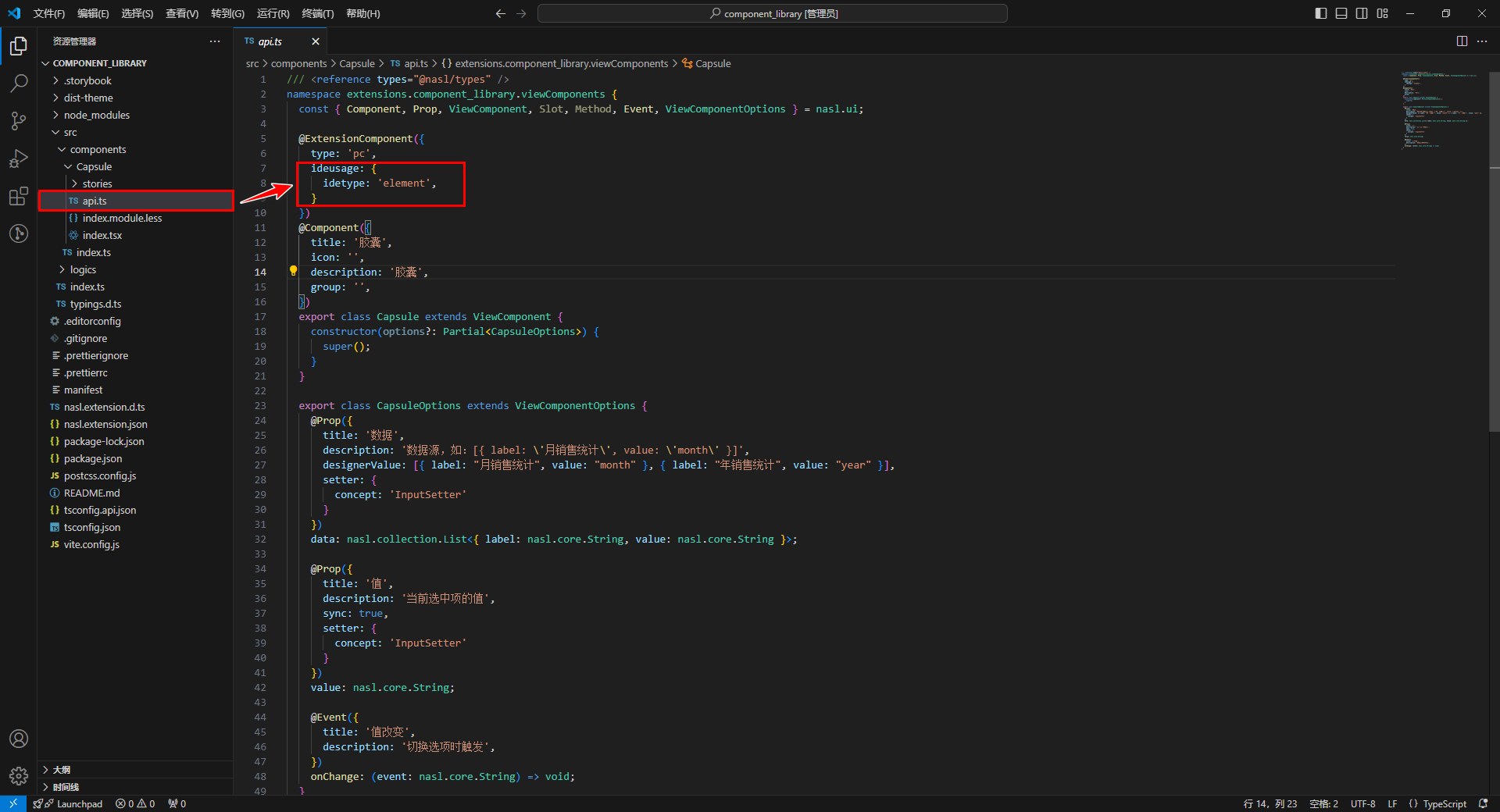
开发者通过在 api.ts 配置 ideusage 将组件接入设计器,从而定制设计器内置的翻译器行为。
设计器内部的翻译结果可以通过在控制台打印预览:
通过在浏览器控制台输入 window.__$dev_runtime__ = true 来开启当前设计器内的代码输出,以便组件配置与目标代码进行比对。
下文以 vue 模板为例,展示配置和翻译器生层代码的匹配关系。React 相似。
1. 前提条件
- PC端 - IDE
3.10以上版本 - H5端 - IDE
3.11以上版本 - React 应用
2. 组件配置说明
接入的组件分为以下几种类型:
- element (默认) :无法再插入子节点的原子组件
- container :可以插入子节点的容器组件
- modal :弹窗类组件
- drawer :抽屉类组件
- messager :消息弹出类组件
- popover :一些弹出框类组件
- router :路由组件
- board : 自由布局组件
开发者可以通过配置 idetype 来指定组件的类型,以element类型为例:
@ExtensionComponent({
  ideusage: {
    idetype: "element"
  }
})
公用配置
开发者可以为组件指定的公用配置如下:
- (选配)forceRefresh: “self” | “parent” ,组件在画布内移动后,强制刷新自己或者父组件
- (选配)forceUpdateWhenAttributeChange: boolean ,组件改变属性后,强制刷新自己
- (选配)ignoreProperty: Array[string],不需要翻译的属性名
element 配置
类型为 element 的组件无法插入子组件,是不可再分的原子组件。
示例-文本组件
以 CloudUI 的文本组件 u-text 为例:u-text 具有 props 属性,其具体形式为 { text: string } 。
参考配置要求:
- 将该组件归类为 element 类型的组件;
- 可以通过双击编辑 text 字段;
- text 字段支持在示例文本和表达式之间切换。
参考配置书写:
@ExtensionComponent({
    "ideusage": {
        "idetype": "element",
        "editable": "text",
        "textholder": "text",
        "useFxOrEg":{"property": "text"}
    }
})
这段配置会生成的vue模板如下:
<u-text data-nodepath="6ac1466240c84a3cbf0f45b5da7c93a4"
    text="普通文本"
    key="component-6ac1466240c84a3cbf0f45b5da7c93a4"
    data-editable="true" >
</u-text>
通过该模板生成html节点如下:
<span vusion-slot-name-edit="text"
    class="u-text__yjhV4gf0"
    data-nodepath="6ac1466240c84a3cbf0f45b5da7c93a4"
    data-editable="true">
普通文本
</span>
需要注意的点:
- 组件内需要将 data-* 的属性透传到生成的DOM节点上
- 组件插槽需要支持设计器内置的
EmptySlot组件和普通html dom元素
配置项说明
- (选配)editable: 可被编辑的属性名
- (选配)textholder:显示文本的属性名
- (选配)
translateBindingProperty: Array[string],可以显示绑定变量的属性名
以 CloudUI 的 u-select 组件组件为例:
@ExtensionComponent({
ideusage: {
"idetype": "container",
"structured": true,
"childAccept": "['u-select-item', 'u-select-group', 'u-select-divider'].includes(target.tag)",
"events": {
"click": true
},
"translateBindingProperty": ["value", "placeholder"]
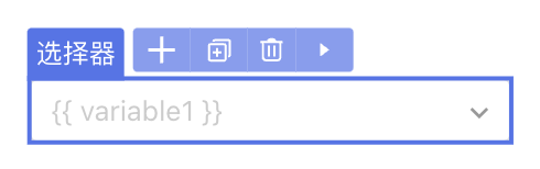
}
})在IDE中用户在 placeholder 上绑定了变量 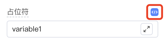
生成的组件代码如下:
<u-select data-nodepath="29d12b2924dc4217ae60dceb991e38a6"
    data-enable-events="click"
    :clearable="true"
    :placeholder="'{{ variable1 }}'"
    :pageSize="50"
    :emptyValueIsNull="true"
    textField="text"
    valueField="value"
    class="" key="component-29d12b2924dc4217ae60dceb991e38a6">

</u-select>
translateBindingProperty 指定的属性,在绑定变量时,可以传入平台内置的、转为字符串的属性字符串。
(选配)
iconEditor:boolean, 支持双击打开icon面板并设置icon(选配)
parentAccept: 可以放入的父组件判断表达式(选配)
additionalAttribute:设计器内组件展示时额外传入的属性, 为{ key: value }形式。需要注意,这里传入的键值对将直接放入模板翻译结果,需要对 " 等特殊符号做转义。(选配)
useFxOrEg: { property: string, displayAsAttr?: boolean }支持表达式和示例切换,property是支持的属性名,displayAsAttr 表示组件是否支持内部插入子元素(选配)
events: 设计器内支持的事件,为{ key: value }形式。key: 事件名称,目前支持click或mousedownvalue: 生效条件,支持true,false, 及表达式
(选配)
elementSutando: 设计器中的替代组件component: 组件名- (选配)
condition: 使用替代组件的条件表达式 - (选配)
selector:{ slot: string, cssSelector: string }
- (选配)
container 配置
类型为 container 的组件可以插入子节点。
示例-卡片组件
以 CloudUI 的卡片组件 u-card 为例。
参考配置要求:
- 组件包含三个插槽;
- 禁止自动插入插槽。
参考配置书写:
由于 disableSlotAutoFill 配置了不自动插入槽位的插槽名,所以设计器只会自动在 default 和 title 插槽下插入可置入组件的槽位。
@ExtensionComponent({
    ideusage: {
        idetype: "container",
        "disableSlotAutoFill": ["cover"]
    }
}
export class UCardOptions extends ViewComponentOptions {
  // ...
  @Slot({
      title: 'undefined',
      description: '插入默认的元素',
  })
  slotDefault: () => Array<ViewComponent>;

  @Slot({
      title: '图片',
      description: '插入图片',
  })
  slotCover: () => Array<ViewComponent>;

  @Slot({
      title: '标题',
      description: '插入文本或 HTML。',
  })
  slotTitle: () => Array<ViewComponent>;
}
这段配置生成的vue模板如下:
<u-card data-nodepath="c3f682566bb94d12ad71144c80d858d8" key="component-c3f682566bb94d12ad71144c80d858d8">
    <EmptySlot data-emptyslot-nodepath="c3f682566bb94d12ad71144c80d858d8"></EmptySlot>
    <template slot="title">
        <div data-nodepath="22e902143270453796cd6d94ee2f0e91">
            <EmptySlot data-emptyslot-nodepath="22e902143270453796cd6d94ee2f0e91"></EmptySlot>
        </div>
    </template>
</u-card>
需要注意的点:
- 组件内需要将 data-* 的属性透传到生成的DOM节点上
- 组件插槽需要支持设计器内置的 EmptySlot 组件和普通html dom元素
示例-数据表格组件
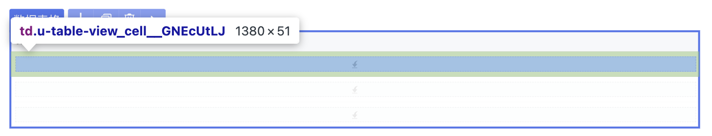
在一些特殊情况中,container类型的组件无法将 data-* 的属性透传到生成的DOM节点上。以 CloudUI 的 表格列 u-tableview-column 为例。
参考配置要求:
- 在IDE中可以完整的选中表格列。
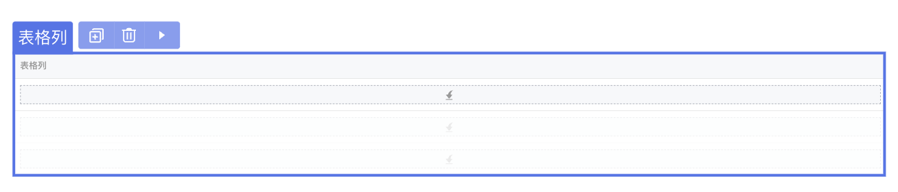
参考配置书写:
组件分为表头和表格内容,为了能够同时选中表格头个表格内容,设计器提供了 selector 配置项,配置项通过向指定的插槽注入内置组件 HoistNodePath ,从而将 data-*的属性复制到上层 cssSelector 可以匹配的 dom 元素。 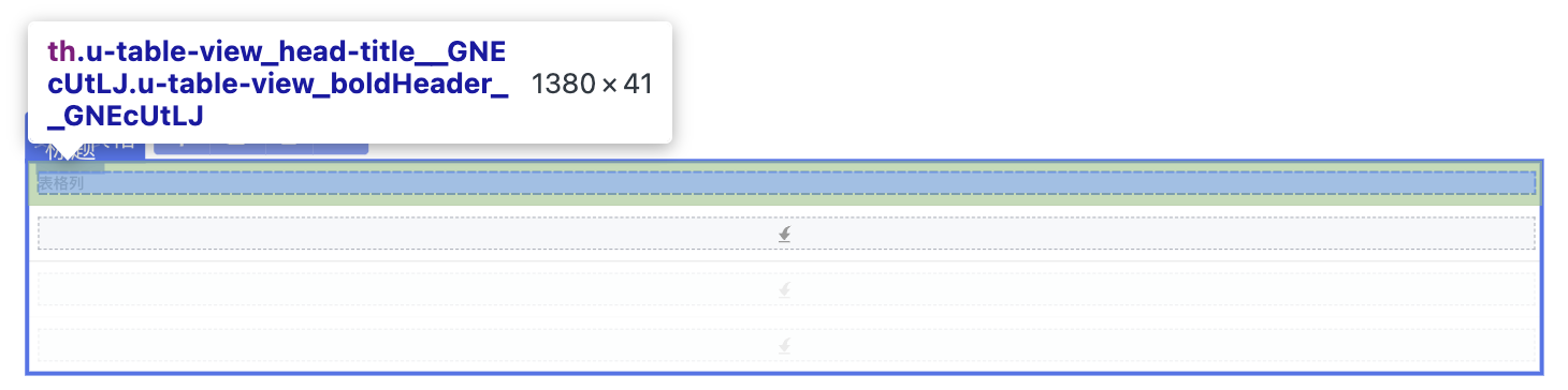
@ExtensionComponent({
    "ideusage": {
        "idetype": "container",
         "selector": [
            {
                "expression": "this.getElement(el => el.slotTarget === 'title')",
                "cssSelector": "th"
            },
            {
                "expression": "this.getElement(el => el.slotTarget === 'cell')",
                "cssSelector": "td"
            },
            {
                "expression": "this.getElement(el => el.slotTarget === 'expand-content')",
                "cssSelector": "tr[class^='u-table-view_expand-content']"
            }
        ]
    }
})
这段配置生成的vue模板如下:
<u-table-view-column field="entity1.updatedTime" key="component-613a75d05eb04790969d9fd1532eb5ab">
    <template #cell={...argus}>
        <HoistNodePath nodePath="613a75d05eb04790969d9fd1532eb5ab" topSelector="td" data-nodepath-multiple="true">
        </HoistNodePath>
        <div data-nodepath="55b20ff830b84a2bb1e4640a2c51496c">
            <EmptySlot data-emptyslot-nodepath="55b20ff830b84a2bb1e4640a2c51496c"></EmptySlot>
        </div>
    </template>
    <template #editcell={...argus}>
        <div data-nodepath="530ebd475ab742d5a7967376ae5132d7">
            <EmptySlot data-emptyslot-nodepath="530ebd475ab742d5a7967376ae5132d7"></EmptySlot>
        </div>
    </template>
    <template slot="title">
        <HoistNodePath nodePath="613a75d05eb04790969d9fd1532eb5ab" topSelector="th" data-nodepath-multiple="true">
        </HoistNodePath>
        <div data-nodepath="a556e6e3851b40578d12022f4d4e1ca3">
            <EmptySlot data-emptyslot-nodepath="a556e6e3851b40578d12022f4d4e1ca3"></EmptySlot>
        </div>
    </template>
    <template #expand-content={...argus}>
        <HoistNodePath nodePath="613a75d05eb04790969d9fd1532eb5ab"
            topSelector="tr[class^='u-table-view_expand-content']" data-nodepath-multiple="true"></HoistNodePath>
        <div data-nodepath="f5b3b0b27b6f43d7806d82ccd97660e2">
            <EmptySlot data-emptyslot-nodepath="f5b3b0b27b6f43d7806d82ccd97660e2"></EmptySlot>
        </div>
    </template>
    <template #expander={...argus}>
        <div data-nodepath="67149ae2ebd6428d89646a6fdc0c6905"><u-table-view-expander
                data-nodepath="cdd6d65d372149e994debc85c0969b85" data-enable-events="click"
                key="component-cdd6d65d372149e994debc85c0969b85" :item="argus.item"></u-table-view-expander></div>
    </template>
</u-table-view-column>
示例-表单组件
设计器还提供了通过 + 来添加子组件的功能。以 CloudUI 的表单组件 u-form 为例。
参考配置要求:
- 在IDE中可以选中表单添加表单分组和表单项。
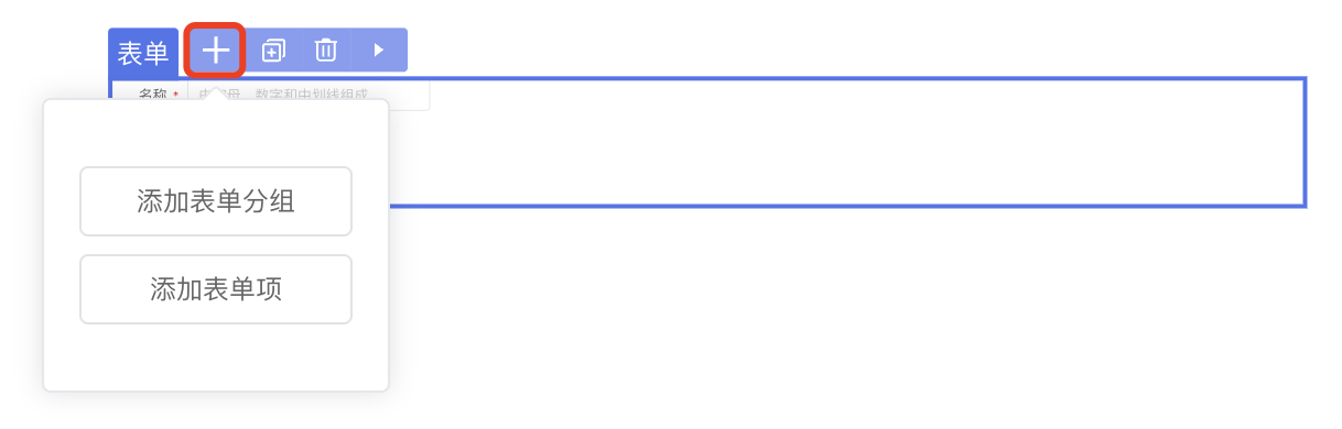
参考配置书写:
通过配置 structured 属性,配合 slot 配置中的 snippets 来配置子组件添加模板。
@ExtensionComponent({
    "ideusage": {
         "idetype": "container",
         "structured": true
    }
})
export class UFormGroupOptions  extends ViewComponentOptions {
        ...
        @Slot({
          title: 'undefined',
          description: '插入`<u-form-item>`子组件。',
          emptyBackground: 'add-sub-large',
          snippets: [
              {
                  title: '表单分组',
                  code: '<u-form-group><template #title><u-text text="分组"></u-text></template><u-form-item><template #label><u-text text="表单项"></u-text></template></u-form-item></u-form-group>',
              },
              {
                  title: '表单项',
                  code: '<u-form-item><template #label><u-text text="表单项"></u-text></template></u-form-item>',
              },
          ],
      })
      slotDefault: () => Array<ViewComponent>;
      ...
}
structure:true表示snippet插入到default插槽内;
structure:slotname表示snippet插入到slotname插槽内;
structure:{ slot: “slotname”, empty: true }表示即使空态也有槽位展示。
示例-单选组组件
当具有 dataSource 属性的组件接入时,需要配置 dataSource 的展示形式。以 CloudUI 的单选组组件 u-radios 为例。
参考配置要求:
- 支持设置数据源。
- 支持在绑定数据源后拖拽插入子组件,使子组件动态展示。
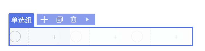
参考配置书写:
@ExtensionComponent({
    "ideusage": {
        "idetype": "container",
        "structured": true,
        "dataSource": {
            "dismiss": "!this.getAttribute('dataSource') && this.getDefaultElements().length > 0",
            "display": 3,
            "loopRule": "nth-child(n+2)",
            "loopElem": "> label[class^='u-radios_radio']:not([data-nodepath])"
        },
        // ...
    }
})
这段配置生成的vue模板,及相关css样式如下:
<u-radios data-nodepath="e19ce4d016414bada1b05a96b7157963"
    key="component-e19ce4d016414bada1b05a96b7157963"
    :dataSource="[{},{},{}]"
    class="ide-style1">
    <template #item={...argus}>
        <div data-nodepath="9474b8caced5485da6f788e1745d02ee">
            <EmptySlot data-emptyslot-nodepath="9474b8caced5485da6f788e1745d02ee"></EmptySlot>
        </div>
    </template>
</u-radios>
<style>
.ide-style1>label[class^='u-radios_radio']:not([data-nodepath]):nth-child(n+2) {
    opacity: 0.2;
}

.ide-style1>label[class^='u-radios_radio']:not([data-nodepath]):nth-child(n+2),
.ide-style1>label[class^='u-radios_radio']:not([data-nodepath]):nth-child(n+2) * {
    pointer-events: none;
}
</style>
需要注意的是:
组件的
dataSource需要支持传入[{}, {}, {}]形态的数据,display: 3表示展示3个{}loopRule 和 loopElem 用于拼接生成的 css 选择器,用于给后面几项的展示增加样式。 dismiss 是当指定条件下,忽略dataSource的设置,即不传入 [{}, {}, {}],也不增加css样式。空态可由slot的配置emptyBackground生效,目前支持
add-sub与add-sub-large。
配置项说明
(选配)
containerDirection: 容器内部排列方向表达式(选配)
translateBindingProperty:Array[string],可以显示绑定变量的属性名(选配)
elementSutando: 设计器中的替代组件component: 组件名- (选配)
condition: 使用替代组件的条件表达式
- (选配)
(选配)
dataSource:具有数据源的组件可设置。具体示例请参考上文示例-单选组组件。(选配)
dismiss:忽略datasource的条件表达式display:在设计器中展示的条数displayData: 设计器中该组件传入的datasource的值,如果设置了,display就不生效了。loopElem:该组件循环的具体DOM节点的css选择器emptySlot: 没有绑定数据源时的占位设置condition:使用占位组件的条件- (选配)
component: 占位的组件名称 accept:可置入的目标表达式- (选配)
display: 如果使用了默认的占位组件的样式,可能的值为:inline,block,默认block
(选配)
parentAccept: 可以放入的父组件判断表达式(选配)
childAccept,表达式或者对象形式。- 表达式形式:
json"childAccept": "target.tag === 'Radio'",- 对象形式,key为slot中配置的名字,value是表达式
json"childAccept": { "default": "this.getDefaultElements().length < 1", "menuItem": "target.tag === 'MenuItem'" }(选配)
selector:若存在无法将data-nodepath传入顶层DOM节点,则可以通过设置此项绕行,绕行是通过向具体组件内部放入一个能够根据css选择器向上查找DOM节点的组件X。为对象或者数组形式。具体示例请参考上文示例-数据表格组件。expression: 从当前节点查找塞入组件X的位置cssSelector: X组件所使用的css选择器
(选配)
structured:true / false | { slot: string, empty?: boolean },当前组件的子组件的插入方式,true表示通过设计器内菜单中"+"插入,false表示通过拖拽插入,empty可以配置是否为此节点插入插槽。如果在slotDefinitions中配置了emptyBackground,则优先展示emptyBackground。具体示例请参考上文示例-表单组件。(选配)
events: 设计器内支持的事件,为{ key: value }形式。key: 事件名称,目前支持click或mousedownvalue: 生效条件,支持true,false, 及表达式
(选配)
additionalAttribute:设计器内组件展示时额外传入的属性, 为{ key: value }形式。(选配)
displaySlotConditions:左侧结构树上条件展示插槽节点,为{ key: value }形式。不配置的插槽名称默认都展示,即为truekey: 插槽名称,同slots配置下的name属性value: 插槽展示条件,支持true,false, 及表达式
以 react antd 的组件 menuitem 为例:该配置描述了当 lableIsSlot 这个属性值为 true 的时候,labelSlot 这个槽位才会展示在结构树上。
json"displaySlotConditions": { "labelSlot": "this.getAttribute('labelIsSlot').value === true" }(选配)
namedSlotOmitWrapper:boolean,插槽不翻译DIV外包裹。(选配)
slotWrapperInlineStyle:传入插槽外包裹的样式,例如:
其中
file-list是slot的名字。json"slotWrapperInlineStyle": { "file-list": "display:flex" }(选配)
slotInlineStyle:插槽的样式,为{ key: value }形式。例如:分栏布局组件的布局栏高度。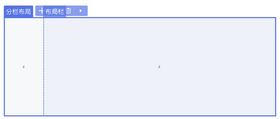
其中
default是slot的名字。json"slotInlineStyle": { "default": "height:100%;" }(选配)
displaySlotInline:插槽外包裹使用行内样式的条件,{ key: value }形式。例如:单选组的选项。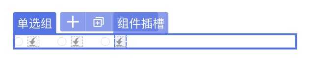 json
json"displaySlotInline": { "item": true }(选配)
disableSlotAutoFill:string | { slot: string, expression?: expression, fill?: expression },禁止自动插入插槽,可配置插槽名称,生效条件,替换的内容,例如:json"disableSlotAutoFill": [{ "slot": "title", "expression": "this.getAttribute('title')", "fill": "this.getAttribute('title').value" }],(选配)
useTemplateInDefaultSlot:boolean,标识可以支持名为default的插槽为单个NASL节点(选配)
expandWhenHesitate:boolean,悬停可撑开(选配)
iconEditor:boolean, 支持双击打开icon面板并设置icon(选配)
operator:{ copy?:expression, cut?: expression, duplicate?: expression, d2c?: expression }支持的操作配置,不配默认全支持,expression为生效的条件(选配)
useFxOrEg:{ property: string, displayAsAttr?: boolean }支持表达式和示例切换,property是支持的属性名,displayAsAttr表示组件支不支持内部插入子元素
modal | drawer | messager 配置
类型为 modal、 drawer、 messager 的组件分别对应了弹窗、抽屉、弹出消息三种组件:
示例-弹窗组件
以 CloudUI 的弹窗为例:
@ExtensionComponent({
"ideusage": {
"idetype": "modal",
"selector": {
"expression": "this.getElement(el => el.slotTarget === 'body')",
"cssSelector": "div[class^='u-modal_dialog']"
},
"cacheOpenKey": "visible",
...
}
})这段配置会生成如下模板代码:
<u-modal key="component-0318bd77736b4ec48ac739ec78ff55ba" :visible="true">
<template slot="title">
<div data-nodepath="734cd0e5ed8943f8b24493a2b04cd7f6">
<EmptySlot data-emptyslot-nodepath="734cd0e5ed8943f8b24493a2b04cd7f6"></EmptySlot>
</div>
</template>
<template slot="body">
<HoistNodePath nodePath="0318bd77736b4ec48ac739ec78ff55ba" topSelector="div[class^='u-modal_dialog']">
</HoistNodePath>
<div data-nodepath="ec5a186379744599a5d5ecfcf5322fb4">
<EmptySlot data-emptyslot-nodepath="ec5a186379744599a5d5ecfcf5322fb4"></EmptySlot>
</div>
</template>
<template slot="foot">
<div data-nodepath="c3b7f6018e9746db9c6bd4dfef063a71">
<EmptySlot data-emptyslot-nodepath="c3b7f6018e9746db9c6bd4dfef063a71"></EmptySlot>
</div>
</template>
<template slot="heading">
<div data-nodepath="b08d6c6b2552461eac38cfdf037e49a0">
<EmptySlot data-emptyslot-nodepath="b08d6c6b2552461eac38cfdf037e49a0"></EmptySlot>
</div>
</template>
<EmptySlot data-emptyslot-nodepath="0318bd77736b4ec48ac739ec78ff55ba"></EmptySlot>
</u-modal>
HoistNodePath从 body slot 内,向上注入data-*属性到能匹配div[class^=‘u-modal_dialog’]的dom元素上。
配置项说明
- (选配)
parentAccept: 可以放入的父组件判断表达式 - (选配)
childAccept,表达式或者对象形式。 selector:若存在无法将data-nodepath传入顶层DOM节点,则可以通过设置此项绕行,绕行是通过向具体组件内部op一个能够根据css选择器向上查找DOM节点的组件X。expression: 从当前节点查找塞入组件X的位置cssSelector: X组件所使用的css选择器
- (选配)
modalSutando:设计器中的占位组件 additionalAttribute:设计器内组件展示时额外传入的属性, 为 { key: value } 形式。cacheOpenKey: 控制弹窗显隐的字段useFeedbackWrapper:渲染时,使用额外的div包裹组件feedbackAliaName:出现在反馈框内的名称
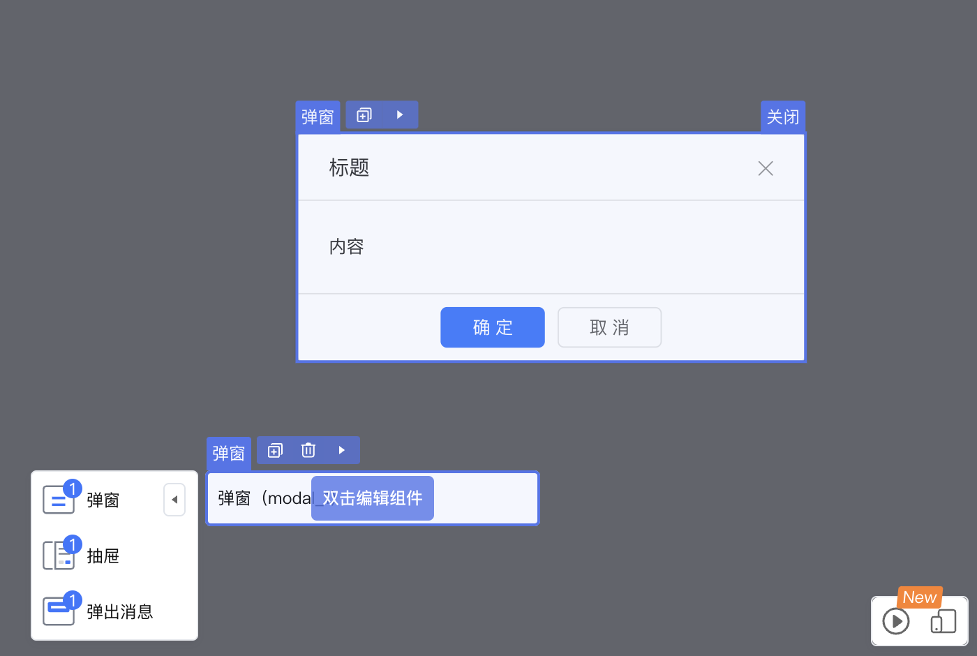
可以在设计器内,通过双击打开组件弹窗,通过关闭按钮关闭当前弹窗。
弹窗类组件必须配置
selector,用于选中弹窗组件本身,否则将出现无法拖入组件,关闭按钮出不来的问题。另外还需要设置
cacheOpenKey,用于向弹窗组件传递开关状态,值为属性名称。
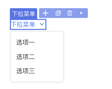
popover 配置
类型为 popover 的组件为弹出框类的组件,这类组件一般分为两部分,触发弹出框和框体本身,触发部分一般不带本身的dom元素,以子组件的dom元素为触发事件来源。
示例-下拉菜单组件
以 react 的下拉菜单组件 Dropdown 为例:
@ExtensionComponent({
"ideusage": {
"idetype": "popover",
"structured": true,
"namedSlotOmitWrapper": ["menuItem"],
"childAccept": {
    "default": "this.getDefaultElements().length < 1",
    "menuItem": "target.tag === 'MenuItem'"
},
"additionalAttribute": {
"menu": "{{ triggerSubMenuAction: 'click' }}",
"trigger": "{['click']}"
},
}
})翻译后的模板为:
<Dropdown key="component-7ce766fcfbea49b2a4e05497bda00fc5"
    menu={{ triggerSubMenuAction: 'click' }}
    trigger={['click']}
    menuItem={(()=> (<>
        <MenuItem data-nodepath="905aaedc246942ab960e37dac8c04456"
            data-anonymous-nodepath="de07f9185b2b4143b8df73699f7a8214" label="导航项目" path="https://www.baidu.com"
            key="component-905aaedc246942ab960e37dac8c04456" labelSlot={(()=> (<>
            <div data-nodepath="bb28a4999c1748e08c4f2c67dbd1316e">
                <EmptySlot data-emptyslot-nodepath="bb28a4999c1748e08c4f2c67dbd1316e"></EmptySlot>
            </div>
        </>))()} ></MenuItem>
        <MenuItem data-nodepath="f63421583fac4df78ecd8aa45a35488a"
            data-anonymous-nodepath="de07f9185b2b4143b8df73699f7a8214" label="导航项目2"
            key="component-f63421583fac4df78ecd8aa45a35488a" labelSlot={(()=> (<>
            <div data-nodepath="3a69cfcc46124eb299b760f70d29f807">
                <EmptySlot data-emptyslot-nodepath="3a69cfcc46124eb299b760f70d29f807"></EmptySlot>
            </div>
        </>))()} ></MenuItem>
    </>))()} >
    <Link data-nodepath="9cc435699e93484e80bfaa584e637567"
        data-anonymous-nodepath="7ce766fcfbea49b2a4e05497bda00fc5"
        data-enable-interaction={bindref}
        data-enable-events="click"
        icon="RiArrowDownSLine"
        children="按钮"
        key="component-9cc435699e93484e80bfaa584e637567"
        data-editable="true">
    </Link>
</Dropdown>
由于Dropdown没有自己对应的dom元素,所以通过
data-anonymous-nodepath附着在了内部的Link上,Dropdown的 menuItem 只接受 MenuItem 组件,所以通过namedSlotOmitWrapper去除了原本会注入的外层div元素。
配置项说明
- (选配)
parentAccept: 可以放入的父组件判断表达式 - (选配)
childAccept,表达式或者对象形式。 - (选配)
selector:若存在无法将data-nodepath传入顶层DOM节点,则可以通过设置此项绕行,绕行是通过向具体组件内部放入一个能够根据css选择器向上查找DOM节点的组件X。为对象或者数组形式。expression: 从当前节点查找塞入组件X的位置cssSelector: X组件所使用的css选择器- (选配)
placement:‘head’ | ‘tail’,插入组件X的位置,默认是’head’
- (选配)
structured:true / false,当前组件的子组件的插入方式,true时只能通过设置的snippet增加子元素,false为通过拖拽插入 - (选配)
additionalAttribute:设计器内组件展示时额外传入的属性, 为{ key: value }形式。
3. 表达式API说明
表达式分为两种:
- 带
target参数:parentAccept、childAccept、accept配置项 - 不带
target参数:其他的表达式
表示内部通过 this 来指向自己,this上定义了一系列的属性和API:
type Attribute {
    name: string,
    value: any
}
class Element {
    // 处于的slot名称
    slotTarget: string

    // 获取当前的参数
    getAttribute: (attrname: string) => Attribute

    // 根据条件获取子元素
    getElement: (filter: (el: Element) => boolean) => ?Element
    // 根据条件过滤子元素
    filterElement: (filter: (el: Element) => boolean) => Element[]
    // 获得父节点
    getParent: () => Element
    // 子节点个数
    elementsLength: () => number

    // 获取祖先节点
    getAncestor: (tag: string) => ?Element
}

class Target {
    // 对应到nasl节点的concept
    concept: string;
    // 目标的 tag 属性
    tag: string;
}
示例一
这段表达了Flex是一个container,他的containerDirecion由当前设计器内设置的direction属性值决定。
{
    "name": "Flex",
    "ideusage": {
        "idetype": "container",
        "containerDirection": "this.getAttribute('direction')?.value === 'true' ? 'column' : 'row' "
    }
}
示例二
这段表达了Table是一个container,他的内部只允许放入TableColumn,只能通过snippet增加子节点,他具有数据源的特性,默认展示3条假记录,根据’table > tbody > tr’这个选择器来禁用除了第一条以外的假数据,在当前没有设置dataSource属性或者当前子节点数量为0时,展示占位。
TableColumn也是一个container,不支持放入子元素,只允许放入Table中,由于组件实现问题,只能通过向其title的slot内部放入一个能够根据css选择器,向上查找DOM节点的组件,
{
    "name": "Table",
    "ideusage": {
        "idetype": "container",
        "containerDirection": "row",
        "structured": true,
        "dataSource": {
          "display": 3,
          "loopElem": "table > tbody > tr",
          "emptySlot": {
            "condition": "!this.getAttribute('dataSource') || this.elementsLength() === 0",
            "accept": "target.concept === 'Entity'"
          }
        },
        "childAccept": "target.tag === 'TableColumn'"
    }
}
{
    "name": "TableColumn",
    "ideusage": {
        "idetype": "container",
        "childAccept": false,
        "parentAccept": "target.tag === 'Table'",
        "containerDirection": "row",
        "selector": {
          "expression": "this.getElement(el => el.slotTarget === 'title')",
          "cssSelector": "th"
        }
    }
}
示例三
这段表达了Modal是一个modal类型的组件,由于组件实现问题,只能通过向其内部放入一个能够根据css选择器:“div[class=‘ant-modal-content’]”,向上查找DOM节点的组件。为了去除弹窗编辑时的闪动,需要额外增加设计器专门的配置 additionalAttribute。
{
    "name": "Modal",
    "ideusage": {
        "idetype": "modal",
        "selector": {
          "expression": "this",
          "cssSelector": "div[class='ant-modal-content']"
        },
        "additionalAttribute": {
            "transitionName": "''",
            "maskStyle": "{{opacity: 1,animationDuration: '0s'}}"
        }
    }
}
示例四
这段表达了Popover是一个popover类型的组件,由于组件实现问题,只能通过向其content的slot内部放入一个能够根据css选择器:“div[class=‘ant-popover-content’]”,向上查找DOM节点的组件。通过设置actions,用户能在设计器内部通过点击,修改组件的临时状态,通过open或close方法,打开关闭下拉框编辑。
 {
    "name": "Popover",
    "ideusage": {
        "idetype": "popover",
        "selector": {
          "expression": "this.getElement(el => el.slotTarget === 'content')",
          "cssSelector": "div[class='ant-popover-content']"
        }
    }
}