element 配置说明
类型为 "element" 的组件无法插入子组件,是不可再分的原子组件。
@ExtensionComponent({
  ideusage: {
    "idetype"idetype: "element"
  }
})
下文以 vue 模板为例,展示配置和翻译器生层代码的匹配关系。React 相似。
示例
以 CloudUI 的文本组件 u-text 为例:u-text 具有 props 属性,其具体形式为 { text: string } 。
参考配置要求:
- 将该组件归类为 element 类型的组件;
- 可以通过双击编辑 text 字段;
- text 字段支持在示例文本和表达式之间切换。
参考配置书写:
@ExtensionComponent({
    ideusage: {
        "idetype": "element",
        "editable": "text",
        "textholder": "text",
        "useFxOrEg":{"property": "text"}
    }
})
这段配置会生成的vue模板如下:
<u-text data-nodepath="6ac1466240c84a3cbf0f45b5da7c93a4"
    text="普通文本"
    key="component-6ac1466240c84a3cbf0f45b5da7c93a4"
    data-editable="true" >
</u-text>
通过该模板生成html节点如下:
<span vusion-slot-name-edit="text"
    class="u-text__yjhV4gf0"
    data-nodepath="6ac1466240c84a3cbf0f45b5da7c93a4"
    data-editable="true">普通文本</span>
需要注意的点:
- 组件内需要将 data-* 的属性透传到生成的DOM节点上
- 组件插槽需要支持设计器内置的 EmptySlot 组件和普通html dom元素
配置项说明
editable
选配,定义可被编辑的属性。书写格式为"editable": "可被编辑的属性名",例如:
"editable": "text"示例中的 text 属性来源于 api.ts 中的属性描述,实现属性描述请参考组件配置编写说明。
textholder
选配,定义显示文本的属性。书写格式为"textholder": "显示文本的属性名",例如:
"textholder": "text"示例中的 text 属性来源于 api.ts 中的属性描述,实现属性描述请参考组件配置编写说明。
translateBindingProperty
选配,定义可以显示绑定变量的属性。书写格式为 "translateBindingProperty": Array[String],Array[String]即属性名的数组。
示例
以 CloudUI 的选择器组件 u-select 为例。
@ExtensionComponent({
ideusage: {
"idetype": "container",
"structured": true,
"childAccept": "['u-select-item', 'u-select-group', 'u-select-divider'].includes(target.tag)",
"events": {
"click": true
},
"translateBindingProperty": ["value", "placeholder"]
}
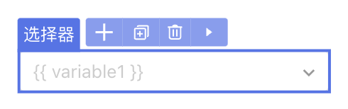
})此处 translateBindingProperty 定义的分别为选择器的“选中值”和“占位符”属性,属性描述如下:
@Prop({
  title: '选中值'
})
value: USelectOptions<T, V, P, M, C>['value'];
@Prop({
  group: '主要属性',
  title: '自动获取焦点',
  description: '设置是否自动获取焦点',
  docDescription: '控制是否在进入页面时聚焦到该组件',
  designerValue: false,
  setter: {
    concept: 'SwitchSetter'
  }
})
placeholder: nasl.core.String = '请选择';
IDE 中的效果
在IDE中,若为“占位符”属性 placeholder 绑定变量,则该属性允许传入平台内置的相关属性字符串。
拖拽生成组件后,在页面设计器中生成的代码如下:
<u-select data-nodepath="29d12b2924dc4217ae60dceb991e38a6"
    data-enable-events="click"
    :clearable="true"
    :placeholder="'{{ variable1 }}'"
    :pageSize="50"
    :emptyValueIsNull="true"
    textField="text"
    valueField="value"
    class="" key="component-29d12b2924dc4217ae60dceb991e38a6">

</u-select>
iconEditor
选配,定义是否支持双击组件打开icon面板并设置icon。书写格式为"iconEditor":Boolean,例如:
"iconEditor":true
parentAccept
选配,定义可以放入当前组件的父组件。书写格式为"parentAccept":"判断表达式",例如要求组件只能置入到面包屑组件 u-crumb 中:
"parentAccept": "target.tag === 'u-crumb'"additionalAttribute
选配,定义设计器内组件展示时额外传入的属性。书写格式为”additionalAttribute“: { key: value } 。
示例
要求取消 react modal 在设计器里的弹出动画:
@ExtensionComponent({
    "ideusage": {
      "idetype": "modal",
      ...
      "additionalAttribute": {
        "transitionName": "''",
        "maskStyle": "{{opacity: 1,animationDuration: '0s'}}"
      },
      "cacheOpenKey": "open"
    }
})
需要注意,传入的键值对将直接放入模板翻译结果,需要对 " 等特殊符号做转义。
IDE 中的效果
拖拽生成组件后,在页面设计器中生成的代码如下:
<Modal okText="确定" cancelText="取消"
key="component-24445f4bd7be4acdb923d4e53c06fe58"
open={true}
transitionName=''
maskStyle={{opacity: 1,animationDuration: '0s'}}
title={...}
footer={...}>
...
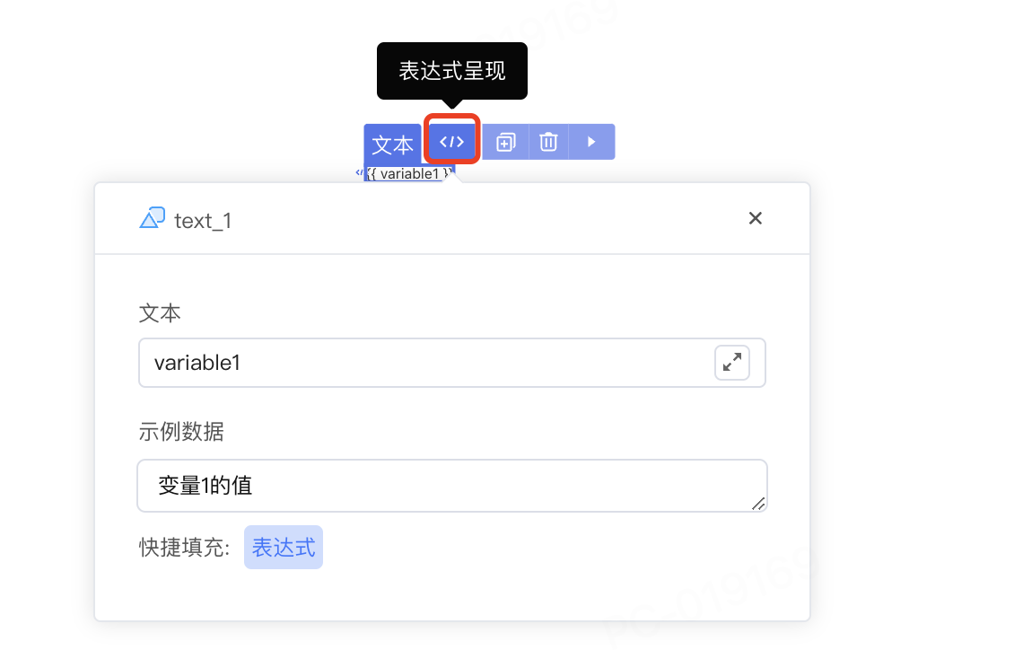
</Modal>useFxOrEg
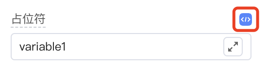
选配,定义支持表达式和示例切换的属性。书写格式为useFxOrEg: { property: String, displayAsAttr?: Boolean } 。
- property:表示支持的属性名;
- displayAsAttr: 表示组件是否支持内部插入子元素。
例如:
"useFxOrEg":{"property": "text"}示例中的 text 属性来源于 api.ts 中的属性描述,实现属性描述请参考组件配置编写说明。
在IDE中,若为文本属性 text 绑定变量,支持切换显示表达式和示例数据。
events
选配,定义页面设计器内支持的事件。书写格式为"events": { key: value } 。
- key:表示事件名称,目前支持 click 或 mousedown;
- value:表示生效条件,支持 true、false以及表达式。
例如为折叠面板组件定义点击事件,支持点击后在设计器中打开和关闭折叠面板项:
"events": {"click": true}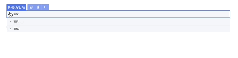
elementSutando
选配,定义页面设计器中的替代组件,如果设计器中要展示的组件无法与原组件相同,则可以使用为设计器定制的组件作为替代。书写格式为:
"elementSutando": { "condition": true,
"component": "组件名",
"condition": "使用替代组件的条件判断表达式", //选配
"selector": { //选配
"slot": String,
"cssSelector": String,
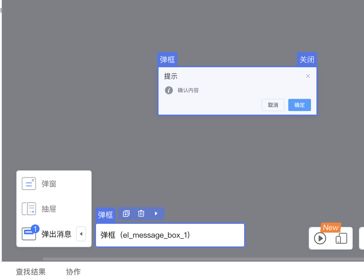
}示例
以 ElementUI 的弹框组件 MessageBox 为例:只能通过element的API唤起,不是一个组件,如果要在设计器里编排,则需要写一个类似的组件作为替身。
@ExtensionComponent({
    ideusage: {
      "idetype": "messager",
      "elementSutando": {
        "condition": true,
        "component": "ElMessageBoxDesigner",
        "selector": {
          "slot": "default",
          "cssSelector": ".el-message-box",
        },
        "useSlot": true,
      },
      "cacheOpenKey": "visible"
    }
  })
IDE 中的效果
style
选配,针对IDE内显示的组件内部元素定义样式。书写格式为style:Array<Object>,Array<Object>即样式键值对的数组。
例如,想要覆盖 van button 组件中,被IDE禁用的动画效果,可以在style中重新定义样式表:
@ExtensionComponent({
    "ideusage": {
        "idetype": "element",
        "useFxOrEg": {
            "property": "text"
        },
        "translateBindingProperty": ["icon", "text"],
        "style": [
            {
                "selector": ".van-loading__spinner",
                "declaration": "animation-duration: 2s!important"
            },
            {
                "selector": ".van-loading__spinner *",
                "declaration": "animation-duration: 2s!important"
            }
        ]
    }
   })