modal | drawer | messager 配置说明
类型为 "modal"、 "drawer"、 "messager" 的组件分别对应了弹窗、抽屉、弹出消息三种组件:
@ExtensionComponent({
  ideusage: {
    "idetype": "modal"     //或"drawer" 或"messager"
  }
})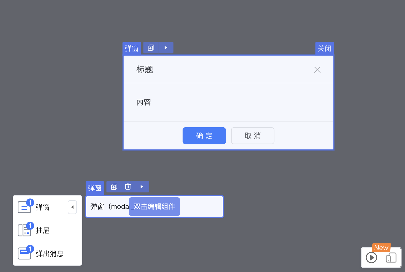
可以在设计器内,通过双击打开组件弹窗,通过关闭按钮关闭当前弹窗。
弹窗类组件必须配置 selector,用于选中弹窗组件本身,否则将出现无法拖入组件,关闭按钮出不来的问题。
另外还需要设置 cacheOpenKey,用于向弹窗组件传递开关状态,值为属性名称。
下文以 vue 模板为例,展示配置和翻译器生层代码的匹配关系。React 相似。
示例
以 CloudUI 的弹窗为例:
 @ExtensionComponent({
     "ideusage": {
            "idetype": "modal",
            "selector": {
                  "expression": "this.getElement(el => el.slotTarget === 'body')",
                  "cssSelector": "div[class^='u-modal_dialog']"
            },
            "cacheOpenKey": "visible",
            ...
        }
  })
这段配置会生成如下模板代码:
<u-modal key="component-0318bd77736b4ec48ac739ec78ff55ba" :visible="true">
    <template slot="title">
        <div data-nodepath="734cd0e5ed8943f8b24493a2b04cd7f6">
            <EmptySlot data-emptyslot-nodepath="734cd0e5ed8943f8b24493a2b04cd7f6"></EmptySlot>
        </div>
    </template>
    <template slot="body">
        <HoistNodePath nodePath="0318bd77736b4ec48ac739ec78ff55ba" topSelector="div[class^='u-modal_dialog']">
        </HoistNodePath>
        <div data-nodepath="ec5a186379744599a5d5ecfcf5322fb4">
            <EmptySlot data-emptyslot-nodepath="ec5a186379744599a5d5ecfcf5322fb4"></EmptySlot>
        </div>
    </template>
    <template slot="foot">
        <div data-nodepath="c3b7f6018e9746db9c6bd4dfef063a71">
            <EmptySlot data-emptyslot-nodepath="c3b7f6018e9746db9c6bd4dfef063a71"></EmptySlot>
        </div>
    </template>
    <template slot="heading">
        <div data-nodepath="b08d6c6b2552461eac38cfdf037e49a0">
            <EmptySlot data-emptyslot-nodepath="b08d6c6b2552461eac38cfdf037e49a0"></EmptySlot>
        </div>
    </template>
    <EmptySlot data-emptyslot-nodepath="0318bd77736b4ec48ac739ec78ff55ba"></EmptySlot>
</u-modal>
HoistNodePath 从 body slot 内,向上注入data-*属性到能匹配 div[class^='u-modal_dialog'] 的dom元素上。
配置项说明
cacheOpenKey
必配,定义控制弹窗显隐的属性。书写格式为"cacheOpenKey": "控制弹窗显隐的属性名",例如:
"cacheOpenKey": "visible"此处 cacheOpenKey 定义的是弹窗的“显示状态”属性,属性描述如下:
@Prop({
      title: '显示状态'
    })
visible: nasl.core.Boolean;
parentAccept
选配,定义可以放入当前组件的父组件。书写格式为"parentAccept":"判断表达式",例如要求组件只能置入到面包屑组件 u-crumb 中:
"parentAccept": "target.tag === 'u-crumb'"childAccept
选配,定义可以放入子组件的组件。书写格式为"parentAccept":"判断表达式"或"parentAccept":Object。
- 表达式形式:
"childAccept": "target.tag === 'Radio'",- 对象形式:key为slot中配置的名字,value是表达式
"childAccept": {
    "default": "this.getDefaultElements().length < 1",
    "menuItem": "target.tag === 'MenuItem'"
  }
selector
选配,若存在无法将data-nodepath 传入顶层DOM节点,可以通过设置此项绕行,绕行是通过向具体组件内部放入一个能够根据css选择器向上查找DOM节点的组件X。书写格式为:
"selector": [
    {
        "expression": String,
        "cssSelector": String
    },
]
selector 中可以为包含 expression 和 cssSelector 的对象或对象的数组。
- expression: 从当前节点查找塞入组件X的位置;
- cssSelector: X组件所使用的css选择器。
additionalAttribute
选配,定义设计器内组件展示时额外传入的属性。书写格式为"additionalAttribute": { key: value } 。
示例
要求取消 react modal 在设计器里的弹出动画:
@ExtensionComponent({
    "ideusage": {
      "idetype": "modal",
      ...
      "additionalAttribute": {
        "transitionName": "''",
        "maskStyle": "{{opacity: 1,animationDuration: '0s'}}"
      },
      "cacheOpenKey": "open"
    }
})
需要注意,传入的键值对将直接放入模板翻译结果,需要对 " 等特殊符号做转义。
IDE 中的效果
拖拽生成组件后,在页面设计器中生成的代码如下:
<Modal okText="确定" cancelText="取消"
        key="component-24445f4bd7be4acdb923d4e53c06fe58"
        open={true}
        transitionName=''
        maskStyle={{opacity: 1,animationDuration: '0s'}}
        title={...}
        footer={...}>
        ...
</Modal>